The medium of TV strikes me as the doggerels of old--it is useful water-cooler conversation endowed with powers of satire, irony, and pathos but without the supporting foundation of print literacy, it would be fruitless flummery. Think about all the poems and songs and tidbits of verse thrown around ye village wells, rivers, saloons, markets, etc.--they built and destroyed political dynasties!
But the information provided by newspapers, magazines, books, and other forms of print media supports this new doggerel, the TV visual image. Words lasso abstract ideas and make them communicable; visual images expand those ideas exponentially, into the recesses that language alone almost cannot reach...
[to be continued--class dismissed]
Tuesday, October 30, 2007
Thursday, October 25, 2007
Letter to the Equipment
 Technology.
Frustrating.
Screamingly frustrating.
Tonight I intended to upload a rough cut of today's footage. However, you shall have to remain in suspense as to the glamorous results of our hard day's labor...
So we used the lovely Sony DCR-SR82. Decent audio, but no manual focus. Bluetooth mic, but no XLR connections. Great lens protection, but no white balance. Cool touch-screen and playback remote, but an un-importable video codec. I felt like I was trying to create a film on a wealthy aunt's home video camera.
Tuesday, October 23, 2007
The Jitterbug
 We start shooting on "The Perfect Man" teaser Thursday, but a few kinks have already crinkled up the plan--from schedule-conflicts to equipment needs. But props are trickling in; miniDV tapes and mini DVDs are ready to go. Project Search&Rescue will be activated when Kevin and I meet this afternoon, and everything should work out...
Sunday Noon
The noon hour of Sunday is almost a sacred hour---half the world is either sleeping in, having lunch, or just starting on that delicious weekly nap. This Sunday I was at home. Petting my dogs. Watching my mom and sister play Wii. Reading poetry for lit class. It was pleasant non-quiet.

Looking out of my living-room picture window. By giving the sky the upper right corner all to itself, I wanted to draw the eye high, just like the lines of the tree trunks leading to the bright blue spot. The concave curve creates a warm, welcoming circle. Overall, the soft natural colors and the lush foliage helped communicate the comfort and protection I feel at home.

Looking beside me, into the house. Trying to get my dog to look forward for this shot took some patient finagling. I liked having her in the foreground with some nose room. The book, Land of Bliss, was the volume of poetry I was reading. The words centered in the frame communicate in words what the picture represents: the pleasant Sunday noon in a warm family home. In the distance--a kitchen counter, thick leather chair, lamps, book bags, green paint, wood column--the rest of the idea is fleshed out, not in sharp focus, but as an aura.
Thursday, October 18, 2007
DiGiTaL rEmIxEs


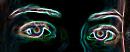
The above photos are digital remixes created in visual communication lab to make a statement on a national or international issue. The group remained the same from the cartoon lab last week--with the addition of Jennifer Salane.
Are visual images worth a thousand words! Definitely. Their inherent power actually scares me. The trickery--for good or evil--available today undermines the veracity of "eye-witness accounts." How can we trust anything outside of (or even including) our own perception as an authentic representation of reality? Hmm. It leads to pondering of deep and absract things...
Thursday, October 11, 2007
Poster Draft

So this is a preliminary draft of our promotional poster for "The Perfect Man". interestingly enough, I was just using MS Paint to through a digital draft together, but when I included the images of the back of Todd's head and the box of Valentine's truffles, I really liked the contrast between the 2D and 3D elements. It would make sense because it provides emphasis to the main character and draws your eye to the heart; one could be really abstract and even say that his world is happy but lifeless before he meets Emma.
My favorite aspect of this design is its subtle cue: the perfect woman made by the box and the ribbon and the bon-bons. The movie is from Todd's perspective--and you are invited to identify with him through the use of the over-the-shoulder shot--but ultimately, it is also a celebration of Emma as his perfect match, the best one after a line of ladies. :)
Any feedback?
If Clemson were a cartoon...

The above cartoon was produced as follows:
By:
Laura Brown
Bailey Buchanan
Josh Courtney
Aaron Naylor
and myself.
In: one hour
For: ENG 332 lab
So: you could enjoy! :) [And Clemson would realize how ridiculous this Fall Break fiasco is]
Tuesday, October 9, 2007
Location Scouting
This morning/afternoon Kevin and I toured our locations, scouting for appropriate locales, equipment support, lighting, and audio. Below are some photos along with notes we made about each spot we visited.
This is Todd's cubicle. The diamond angle keeps his character contained and orderly, like his OCD personality, but because it is a unique angle, it preserves visual interest. We will probably also use this set-up in our promotional poster.

The breakroom is sleek and compact, with interesting piping in the upper corner and a microwave included. The room itself is not small, however. This will help camera set-up be much easier. There is not a door nearby through which Emma can enter in frame, but we may re-storyboard that section to accommodate.

Todd's street connotes a down-town residence. The dramatic shadows were a problem because they create a more three-dimensional feel than we intend for his cut-and-dry character, but if we shoot in the early morning, the problem should diminish enough to be manageable in post-production.

The stairs to his apartment are perfect. They can split the frame and provide interesting angles yet still look flattened and arranged. The static shot of his descending should also be a funny visual comment on 'the perfect man' that he is, haha.

Our office hallway will be wide enough for us to do the tracking shot of his feet. This will be cross-faded from a similar tracking shot down the street. This particular hallway has "office colors"--bland but heavily patterned wall and carpet.

Overall, we have tried to keep a dull, muted color scheme without making Todd's world look particularly depressing. How did we do?
Sunday, October 7, 2007
Jump-starting
"The Perfect Man" promotional suite is a huge project.
We're trying to jump-start this week with a few important things:
*meeting with the cast to finalize the shooting schedule
*designing several posters ideas
*scheduling a photo shoot to get plenty of images to play with
*gathering photos of locations and props
I should have some pix and drafts to upload by Tuesday or Wednesday :)
Thursday, October 4, 2007
A Salute to Graphic Design
United States of America Gymnastics represents the officially endorsed brand of the sport that is exported to the world on an annual basis--and most significantly, on an Olympian basis. Their logo is an important aspect of their communication because it presents the USA to the world--it interacts with a national and international audience as both a business and a formal expression of Americana.

The graphic that bears the most weight, the gymnast if you will, at the center indicates a lot of what the association represents. It's top-heaviness keeps the flight and power of a gymnast from being tied down; however, its absolute symmetry balances it plausibly to the viewer's eye. The arcs imply movement and force without throwing the entire structure off kilter.
The font connotes ties to the Greek tradition of acrobatics and possibly even the Olympics themselves. It is light but well-proportioned and strong. The height compliments the width of each stroke--evenly spaced in all dimensions. By centering "USA" on top of "GYMNASTICS" in all capitals, the logo even construct a podium. The arcs of the graphic above hint at a final, victorious salute. High quality gymnastics--United States of America Gymnastics Association.
Sir Escapee

This image is taken from the title sequence of Stephen Spielberg's Catch Me If You Can. The sequence itself is a masterpiece, a small scale representation of the entire plot.
Sharp abstract shapes, geometric layout, and sleek design bespeak the modernized decades that encapsulate this intricate plot: 1940-60s. The style does not necessarily evoke a particular decade, but the mood it creates ushers the viewer into the commerce, advertising, and capitalism-soaked era of America.
The symbols employed throughout the sequence--including newspapers (as pictured above), stiletto heels, swimming pools, airplanes, and arrows--enhance the readability of the characters, settings, and scenes to come. They are small cues of the ideologies of accessibility, forward-progress, self-made men, and fatal romances--themes that lace themselves through the cat-and-mouse narrative.
Proportion. This concept is exploited to the fullest in this sequence, using size to depict important relationships that will be developed throughout the film. The above image is a good example. Tom Hanks plays the government character assigned to tract and contain Leonardo DiCaprio's character. In the title sequence, the "Tom Hanks man" looms above the slight, slender "Leonardo DiCaprio man" just as Agent Carl Hanratty lurks one step behind con-artist Frank Abagnale Jr. the entire film, breathing down his neck and looking over his shoulder.
Much more could be said of the brilliant title design of Catch Me If You Can; what did you think?
Wednesday, October 3, 2007
Green's Ubiquity

It's green. Lots of green. 10' x 20' of green.
This past weekend I helped friends in Toccoa, GA shoot a green screen sequence. It all started with the construction: 8+ PVC pipes, a hack saw, bungee cords, and Croc clips--and, of course, a ridiculous amount of neon green fabric.
Greenscreen opens up incredible options for visual communication. In this case, we cast some characters as shadows; as in Peter Pan, they dance across walls in a surreal expression of reality. They move independently of the scenery around them, adding to their ubiquitous nature as narrators of the particular story we are creating on film. Capturing their movements on green screen and substituting background footage for the neon green allows them incredible freedom. They can walk through walls, up ceilings, and over clouds--
--they are omniscient narrators.
[I hope to upload samples of the finished product in the future; stay tuned!]
Subscribe to:
Posts (Atom)